Actions
Bug #1633
open
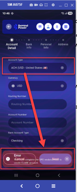
Error message text overlaps or blends with button text due to low contrast background
Start date:
04/14/2026
Due date:
% Done:
0%
Estimated time:
Description
On the Account Details screen, when selecting Account Type (CLABE or PIX), the error message appears with a light background, causing it to visually blend or mix with nearby button text, making it hard to read.
Steps to Reproduce
- Open Account Details screen
- Select Account Type (CLABE or PIX)
- Trigger validation/error message
- Observe error message and button area
Actual Result
- Error message text is not clearly visible
- Text appears mixed/overlapping with button text
- Poor readability due to light background / low contrast
Expected Result
- Error message should be clearly visible and readable
- Proper contrast between text and background
- No overlap or visual confusion with buttons
Files
No data to display
Actions