Actions
Bug #1699
open
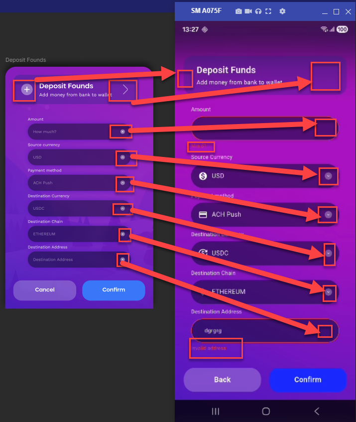
Dropdown icon mismatch and incorrect error message placement on Deposit Funds screen
Start date:
04/15/2026
Due date:
% Done:
0%
Estimated time:
Description
On the Deposit Funds screen, the following issues are observed:
- The dropdown icon UI does not match Figma design
- When an error appears on a tab/field, it is shown on the extreme left side, instead of being properly aligned under the respective tab/field
Steps to Reproduce
- Open Deposit Funds screen
- Observe dropdown icon
- Trigger an error on any tab/field
- Check error message position
Actual Result
- Dropdown icon is not as per Figma
- Error message appears on left side of screen, not aligned with field
Expected Result
- Dropdown icon should match Figma design
- Error message should appear below the respective tab/field properly aligned
Files
No data to display
Actions